How to Analyze Your Revolut Statement
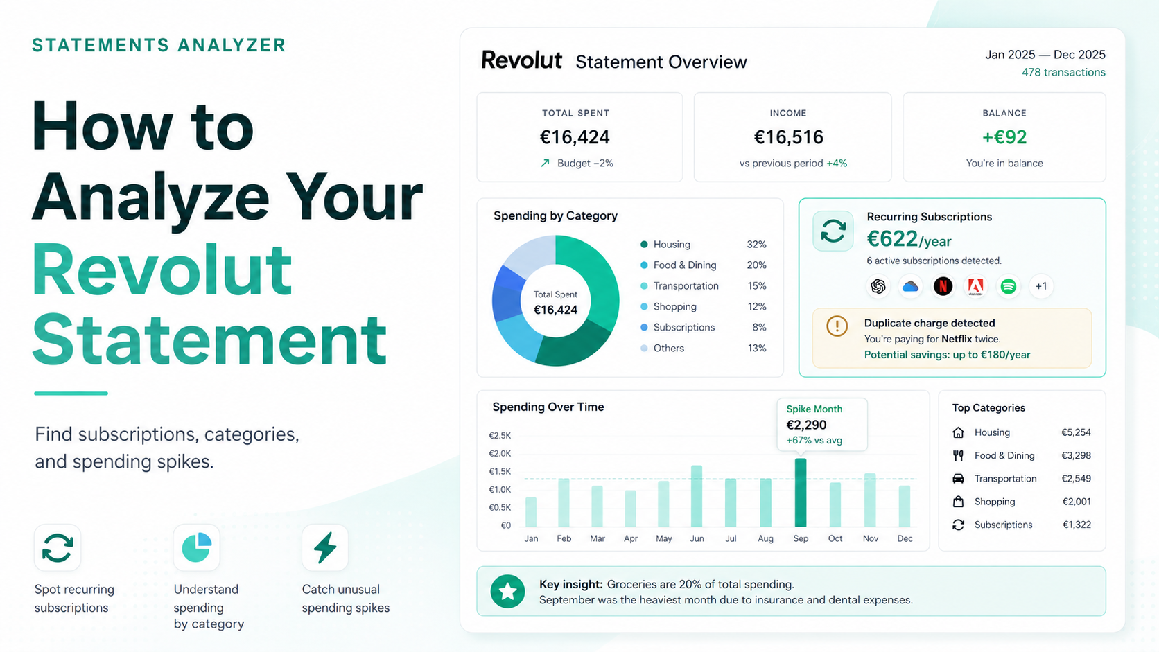
Your Revolut statement already holds the answer to “where did my money actually go?” The app gives you a transaction feed, a ranked category breakdown, and a month-by-month chart — and that part is genuinely useful. What it stops short of is the next layer: what your subscriptions add up to across a whole year, whether the same service is charging you twice, and which months carried most of your spending.
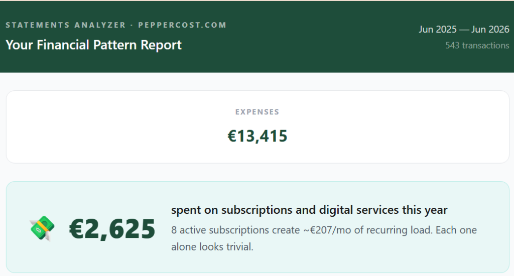
Analyzing a statement means turning that raw feed into a short list of things worth knowing — then deciding what to do about each. Here is what a real analysis pulls out, using one anonymized year as the example: 543 transactions, €13,415 spent.
1. What your subscriptions actually cost
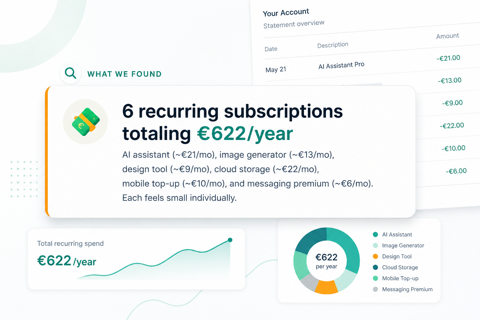
This is the most common surprise, by far. In this statement, eight subscriptions came to €2,625 a year — about €207 a month — and each one looked trivial on its own.
One stood out. OpenAI was charging twice a month, €46 instead of €23: two parallel subscriptions, one on the 1st and one on the 8th, running since October 2025. Nobody sets that up on purpose. It survives because the app never flags that two separate subscriptions to the same service are running at once.
Finding the full list is a job of its own, and it has its own method: how to find recurring charges and subscriptions in your Revolut statement.
2. Where your money actually goes
Category totals, ranked from biggest down. In this year the order ran: transfers to other people €3,349, subscriptions €2,625, food and dining €2,167, supermarkets €1,607, then shopping and transport below that.
Revolut’s own By Category view ranks your spending too, and it does that well. What it doesn’t do is pull subscriptions into a single line — they scatter across Services and Shopping — or make it obvious in plain terms that transfers to other people sat near the top. An analysis lines all of that up in one place, so the order is something you can actually act on.
3. Which months ran hot
Spending is never spread evenly across the year. Here, March through May made up 62% of the entire year’s spending — €8,316 against a €1,118 monthly average. May alone reached €3,447, three times a normal month.
It isn’t all bad news, and a fair analysis says so: seven of the twelve months came in below average, with October as low as €86. The value is in seeing the shape — which months spike, which stay calm — because that’s what lets you see the next expensive month coming instead of being surprised by it.
4. The patterns you’d never scroll to
A good analysis flags things you weren’t looking for. The double OpenAI charge above was one. Another: Saturday was the most expensive card day of the week, €2,441 across the year — 30% more than any other day. Each Saturday purchase was invisible on its own; the pattern only appears once the whole year is added up by weekday.
These are the small, repeating habits that no single transaction reveals — and the ones most worth knowing, because they repeat every month.
Two ways to analyze your Revolut statement
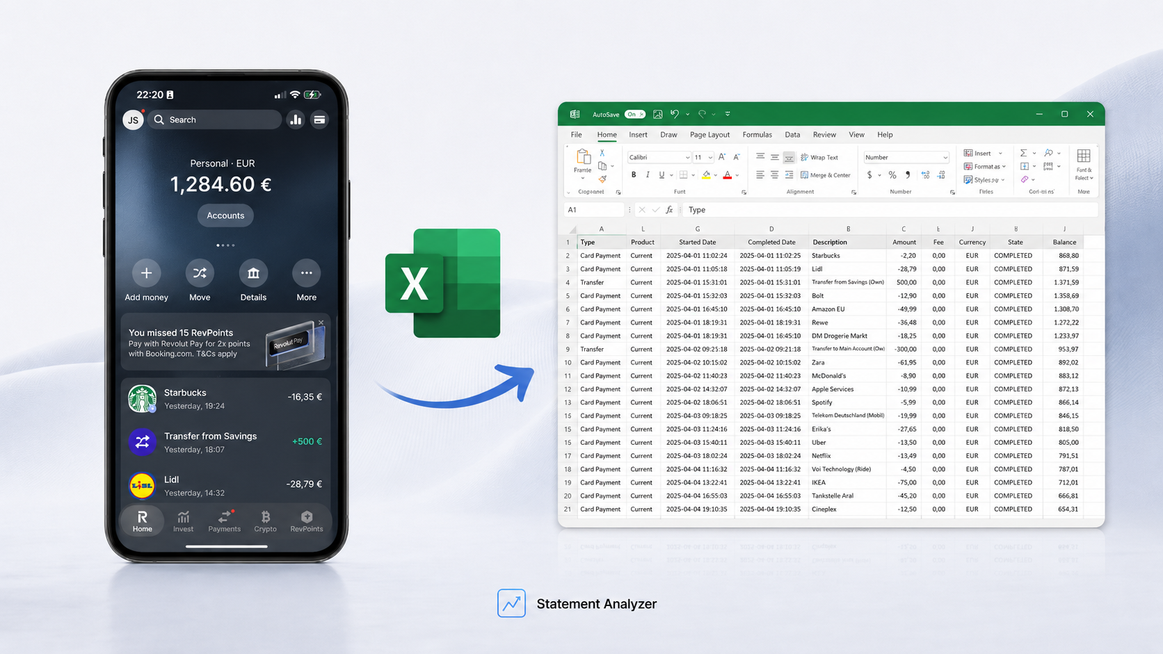
By hand. Export the statement to Excel, sort by merchant, tag the repeats, total your categories. It works, and it costs an hour or two — start with how to export your Revolut statement to Excel, then the recurring-charges method linked above.
Automatically. Upload the same file and get the whole breakdown back — subscriptions and their yearly cost, categories ranked, the months that spiked, the patterns worth a second look — written in plain language instead of raw rows.
→ See where your Revolut money goes — €9.99
Want to see the format first? Here’s a sample report on a real statement.
Analyzing your Revolut statement: FAQ
Export it to Excel from the app, then look for three things: recurring charges (sort by merchant), your biggest spending categories (total each one), and months that ran well above your average. Or upload the file to a tool that does all three automatically.
The app shows transactions, ranked categories, and a month-by-month chart. Analysis adds the parts it skips: your total annual subscription cost pulled out of the categories it scatters them across, and duplicate charges to the same service the app never flags as a problem.
For a manual analysis, yes — a spreadsheet is what lets you sort and total. To analyze it automatically, you upload the exported file and the work is done for you.
Three months shows your recurring charges and recent habits. A full twelve months is better for spotting annual bills and seasonal spikes — like the three-month run that made up most of the year in the example above.
A fair question to ask of any tool, and worth checking before you upload anywhere.